I’m
going to break down my Miami commercial project. It was actually names South Florida’s
Biz Journal Coolest Work Spaces of 2015. Here is a quick breakdown about my creative
process and what I wanted to achieve for my client.
Here
is what the lobby looked like for approx. 3-5 years. Their logo was black white
& red and their office space reflected such. This warehouse has
almost NO windows, the only window in this area is the one you see in the corner {see below} and not much sunlight comes in at all. {This is important, I’ll explain more as
we proceed with the process}
This
is a different angle of the lobby, you can see the one and only window as well
as the four corners of the area. My plan was to ensure that I use all square
footage of the space and ensure the companies brand & style is translated
within the lobby area.
Here
is the color palette I devised for the new space. To see more of my process of
creating a color palette click HERE. I
broke it down to a combination of metallic, sharp eggplant, tantalizing teals, vintage elements
along with rustic and modern fixtures.
Here
I started with a good paint job. The limited natural light in the area drove
me to paint ALL the walls white as a lovely canvas for all the colors, which
would be used. I had the feature wall painted in a black chalkboard paint. The
way the track lights bounce off both the black and white walls was exactly
what I wanted to accomplish for the upcoming color palate.
Here
is another angle of that same paint job.
I
knew we would have a bar somewhere in the lobby so this “BAR” sign was a
purchase made pretty early during the process.
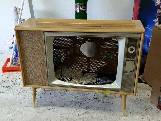
I came up with the idea of using an old TV to create a bar. This is the TV we
ended up using.
I wanted to have a lovely Victorian style
piece to give elegance, class & some curves to this VERY sleek warehouse
space.
This
is the end result. A lovely mix of both modern, clean lined pieces accompanied
by curvy sexy vintage pieces. Splashes of color and unexpected pieces like the vintage
TV bar and keyboard on the wall, really give clients an understanding of what
this awesome entertainment company is about.
Here I leave you with a side by side before
& after of the space. Every time I look at this room I fall in love all over again. It's such a great combination of some of my favorite things. I think I'm going to do a blog post breaking down the furniture pieces. Stay tuned.


I am in love! The purple sofa, the TV turned bar, the chalkboard wall...I love it all!
ReplyDeleteWhat an amazing transformation! It's like we are kindred spirits with these choices you made for this space! Brilliant! I think the old TV idea is genius!
ReplyDeleteI love the sofa. And that bar is genius. You have a wonderful sense of style.
ReplyDeleteYou did a great job of transformation. Much more innovative and classy than the before!
ReplyDeleteGreat Job! Love the transformation!
ReplyDeleteI love the transformation, especially what the Victorian piece.
ReplyDeleteAmazing transformation! So creative!!
ReplyDeleteYour After is such a great improvement on the "cookie cutter" lobby Before. Nice work!
ReplyDeletelove the TV bar.
ReplyDeleteBeautiful transformation!
ReplyDeleteYaaasss!!!! Hot!
ReplyDelete